

A state can look prosperous in one table and constrained in another. A large economy may support a large budget, yet its population may also require extensive services. A smaller jurisdiction can report a strong percentage increase from a modest starting point. Bringing these figures into one place makes comparison easier; it does not decide which comparison answers a useful question. That distinction is central to the state statistics portal being prepared in India.
Business Standard reported on 31 March 2025 that Finance Minister Nirmala Sitharaman was scheduled to launch the NITI NCAER States Economic Forum the following day. Developed by NITI Aayog and the National Council of Applied Economic Research, the initiative combines a historical database with research on state economies and public finances. The announcement creates an opportunity to consider what a common evidence base can change, and which judgments must remain with the person using it.
One destination, several kinds of evidence
The official announcement describes state reports covering 28 states, a repository organised around demography, economic structure, fiscal indicators, health and education, a graphical dashboard, and research commentary. Its stated historical span runs from financial year 1990–91 to 2022–23. These are complementary tools: an overview helps a reader locate a question, a table supports calculation, and a research paper can explain why a relationship deserves attention.
The distinction between those tools matters. A commentary contains an interpretation; a table records observations under particular definitions. A graph selects and displays some of those observations. None should silently substitute for another. A reader who finds an arresting chart should be able to ask what series generated it, while a researcher presenting an interpretation should distinguish the recorded movement from the explanation proposed for that movement.
This is an analytical assessment of the announced resource, not a review of an already launched interface. The launch remains scheduled as of this article’s date. The release does not establish that every variable has an uninterrupted observation for every state in every year. A long overall coverage period should therefore be treated as an invitation to inspect the individual series, not a guarantee that every possible comparison is immediately available.
Start with the decision, then choose the table
Consider three different questions a reader might bring to the same portal. Where is economic activity concentrated? How much public spending is associated with each resident? How has a particular state’s own fiscal position changed? Each question can be reasonable, but they require different measures. Selecting the largest visible number before defining the question risks answering the first when the actual concern was the second or third.
A comparison protocol can begin with a sentence rather than a spreadsheet. For example: “Compare the recorded expenditure per resident for the same financial year, using the same expenditure definition.” That sentence identifies a numerator, a denominator, a period and a boundary. It also exposes the information still needed. If the relevant population estimates or expenditure categories differ, the analyst has found a comparability problem before turning it into a persuasive chart.
There is no universal best denominator. Total spending describes scale; spending per person changes the question to an average relative to population; spending relative to an economic aggregate addresses another relationship. Publishing several measures can be informative if their purposes are explained. Combining them into a single score without explaining the weights can conceal a value judgment behind what appears to be a purely technical result.
A worked example of the denominator problem
Take a deliberately imaginary pair of states, A and B. Suppose A records expenditure of 120 units and a population of 12 units, while B records expenditure of 80 units and a population of four units. A has the larger total. Dividing expenditure by population produces ten for A and twenty for B. The ordering reverses without any number being incorrect. These figures illustrate arithmetic only; they are not observations about an Indian state.
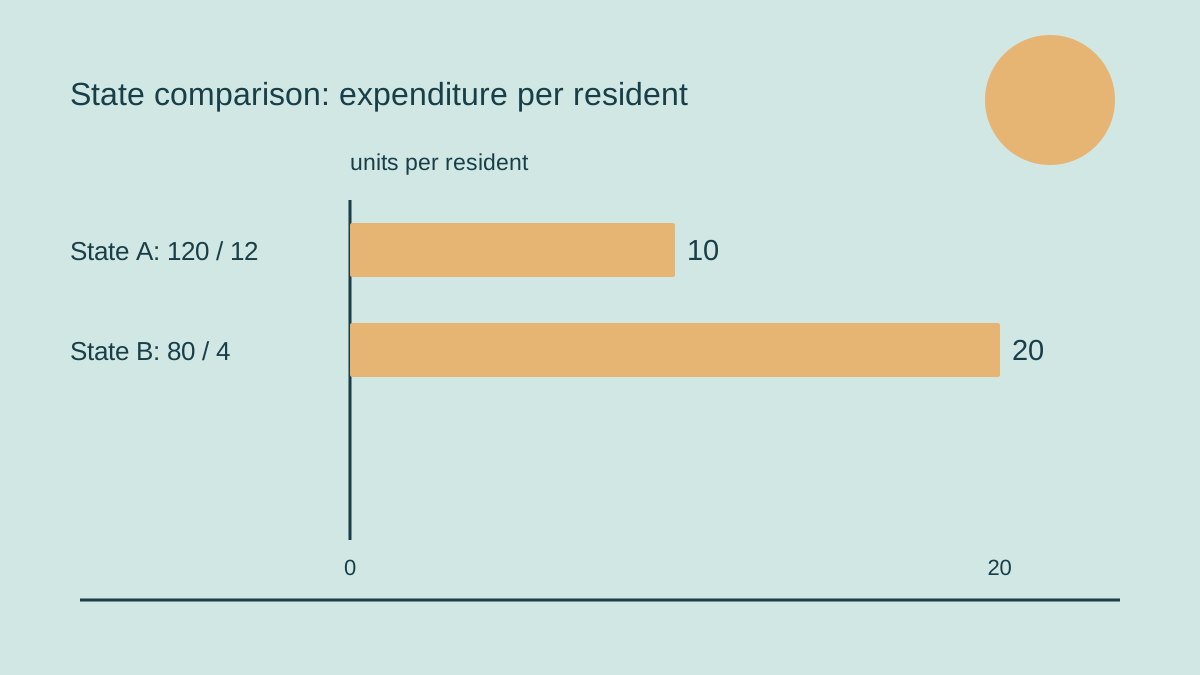
Even the second ordering does not establish that residents receive twice as much useful service. Costs, eligibility, geography, the composition of expenditure and the distribution of services could all matter. The calculated average says what the calculation says: expenditure divided by population. Turning it into a claim about service quality requires separate evidence. A shared repository is valuable partly because it can make the first calculation easier to reproduce, leaving the additional claim visible for scrutiny.
The same discipline applies to ratios over time. If a numerator stays unchanged while its denominator falls, the ratio rises. A headline describing that movement as an expansion of expenditure would misstate the mechanism. Showing the numerator and denominator alongside the ratio lets a reader distinguish additional spending from a change in the base against which spending is measured. This is particularly useful when a chart compresses several years into one upward line.
Financial years and the status of an observation
A portal with a long historical span invites time comparisons, but a date label is only the beginning. An analyst should establish whether two figures refer to the same reporting period. A financial year and a calendar year can describe overlapping but different intervals. Combining them without explanation may create an apparent mismatch that comes from the calendar rather than economic behaviour. The chart title should state the period convention actually used.
The status of the observation is another necessary check. A proposed budget, a revised estimate and a recorded outturn answer different questions wherever such categories appear in the underlying material. Comparing an intention in one jurisdiction with an outcome in another would mix planning and execution. This article does not claim that the announced portal uses a particular labelling system; it identifies a distinction that a careful reader should verify before drawing a conclusion.
It is useful to preserve those labels in working files rather than strip them away during cleaning. A column called “value” is convenient for software but insufficient for another person reviewing the analysis. A compact accompanying note can record the source table, observation status, financial year and retrieval date. That note allows a later reader to understand whether a revised number reflects a correction, a newer release or a genuinely different concept.
Growth requires a consistent price basis
A rising money value is not, by itself, a complete account of growth. When comparing values over time, the reader needs to know whether the series is expressed at current prices or on a stated constant-price basis. The choice affects the question being answered. Current-price values describe amounts in the prices of their periods; a constant-price series attempts to separate volume changes from the influence of changing prices under its methodology.
Suppose a second hypothetical series rises from 100 to 110. The arithmetic increase is ten percent. That calculation alone does not identify how much represents a change in quantities and how much represents price movement. Adding the adjective “real” to a headline requires an appropriate series and supporting definition, not an assumption about what inflation probably did. The portal announcement is not a substitute for reading that definition.
Long comparisons can also encounter changes in base years or statistical methods. A smooth line may connect values that were not originally designed to form one uninterrupted series. Where metadata identify a break, the honest presentation can mark it, restrict the comparison, or explain a documented linking method. The objective is not to discard historical data but to keep the strength of the conclusion proportional to the continuity of the evidence.
Missing values deserve their own treatment
A blank cell and a zero are different statements. Zero records an amount under a definition; a blank may indicate that an observation is unavailable, not applicable or not yet entered. Replacing blanks with zero can lower an average and manufacture a decline. Conversely, removing all incomplete rows can change the composition of a comparison without making that change obvious to the reader.
A practical first pass should therefore count coverage before calculating performance. Which states have the selected variable for the selected year? Which have it at both ends of the proposed growth interval? Does the comparison include the same set throughout? Those questions are especially important for an overall repository spanning many years. The announcement’s broad temporal range does not answer them at the level of an individual indicator.
If coverage is incomplete, the presentation can say so directly. A table might show the available observations and leave unavailable ones marked, while a note describes the narrower sample used for an average. An analyst may sometimes make an explicit estimate, but an estimated value should remain distinguishable from a reported one. The convenience of a complete-looking chart is not evidence that the missing information was actually observed.
Choosing peers without choosing the answer
A state can be compared with a national aggregate, with all available states, with neighbours or with a selected peer group. Each comparison creates a different frame. A peer group chosen after seeing the results can make almost any position appear unusually strong or weak. Defining the selection rule in advance makes the exercise more useful: the reader can assess whether the comparison fits the question rather than merely supports the headline.
For example, an inquiry into public service delivery might justify looking at population structure or settlement patterns before selecting peers. An inquiry into industrial composition would require a different rationale. This does not mean that states must be identical before comparison becomes possible. It means that important differences should be named and considered. A common database lowers the effort of assembling observations; it cannot choose the appropriate interpretation for every purpose.
Ranks are especially sensitive to this framing. A move from fifth to fourth can result from a change elsewhere even if the state’s own value barely moves. The size of the gap also matters: adjacent positions may be close together or far apart. Publishing the underlying values alongside the rank helps distinguish a substantial difference from an ordering that overstates the practical distance between two observations.
Association is a lead for investigation
With economic, fiscal and social indicators gathered together, users may notice that two series move in the same direction. That is a useful beginning for a question. It is not sufficient to establish that one movement caused the other. Timing, a third influence, differences in measurement and reverse relationships are all possible issues to investigate. A dashboard can reveal a pattern without resolving its explanation.
A more careful narrative separates three layers. First comes the observation: what the selected data show. Next comes an interpretation: a proposed account of the relationship. Finally comes the evidence needed to test that account. This structure prevents an attractive explanation from being presented as if it were another cell in the dataset. It also gives research commentary a clear role without treating every interpretation as an official statistical finding.
Historical comparisons should be equally cautious about transferring a policy from one setting to another. A measure associated with an improvement in one state may depend on administrative capacity, starting conditions or complementary changes. The repository can help identify a case worth studying. A decision to replicate it requires attention to the mechanism and circumstances, including evidence outside the numerical series itself.
A reproducible path from portal to publication
The most useful working output may be a small evidence folder rather than a complicated model. It can preserve the selected table, a note on definitions and a short calculation record. Where downloading is possible, the original file should remain identifiable; where it is not, the extraction method should be stated. These are suggested research practices, not claims about functions promised for the forthcoming interface.
- Write the question and comparison group before selecting favourable results.
- Record the indicator definition, units, period and observation status.
- Check missing values, changes of method and the compatibility of denominators.
- Keep the original observations separate from calculated ratios or estimates.
- Present the result with enough context for another reader to reproduce it.
A correction then becomes manageable. If an underlying observation changes, the researcher can identify which calculation and sentence depend on it. Without that trail, a revised chart may leave an old interpretation circulating elsewhere. Traceability therefore serves readers as well as analysts: it makes disagreement specific, allows errors to be corrected and prevents a neat presentation from becoming detached from its source.
What success would look like after the launch
The announced portal’s immediate promise is reduced friction in finding and relating state-level evidence. Its longer-term analytical value would come from users being able to move from a broad overview to a defensible, reproducible comparison. That is a more demanding standard than simply displaying many indicators. It asks whether the source and limitations remain visible as information travels into presentations, reporting and public discussion.
As of 31 March, the appropriate conclusion is prospective. The planned launch offers a common starting point, while actual usability and the detail of individual series still need to be examined. A responsible reader should welcome easier access and retain the habit of asking what each figure measures. Better access expands the number of questions that can be investigated; careful comparison determines whether the resulting answers deserve confidence.
Sources: Business Standard; Press Information Bureau / NITI Aayog.






Leave a comment